Cafe Wands, visual research & design exploration.
Watercolor Renderings for City View
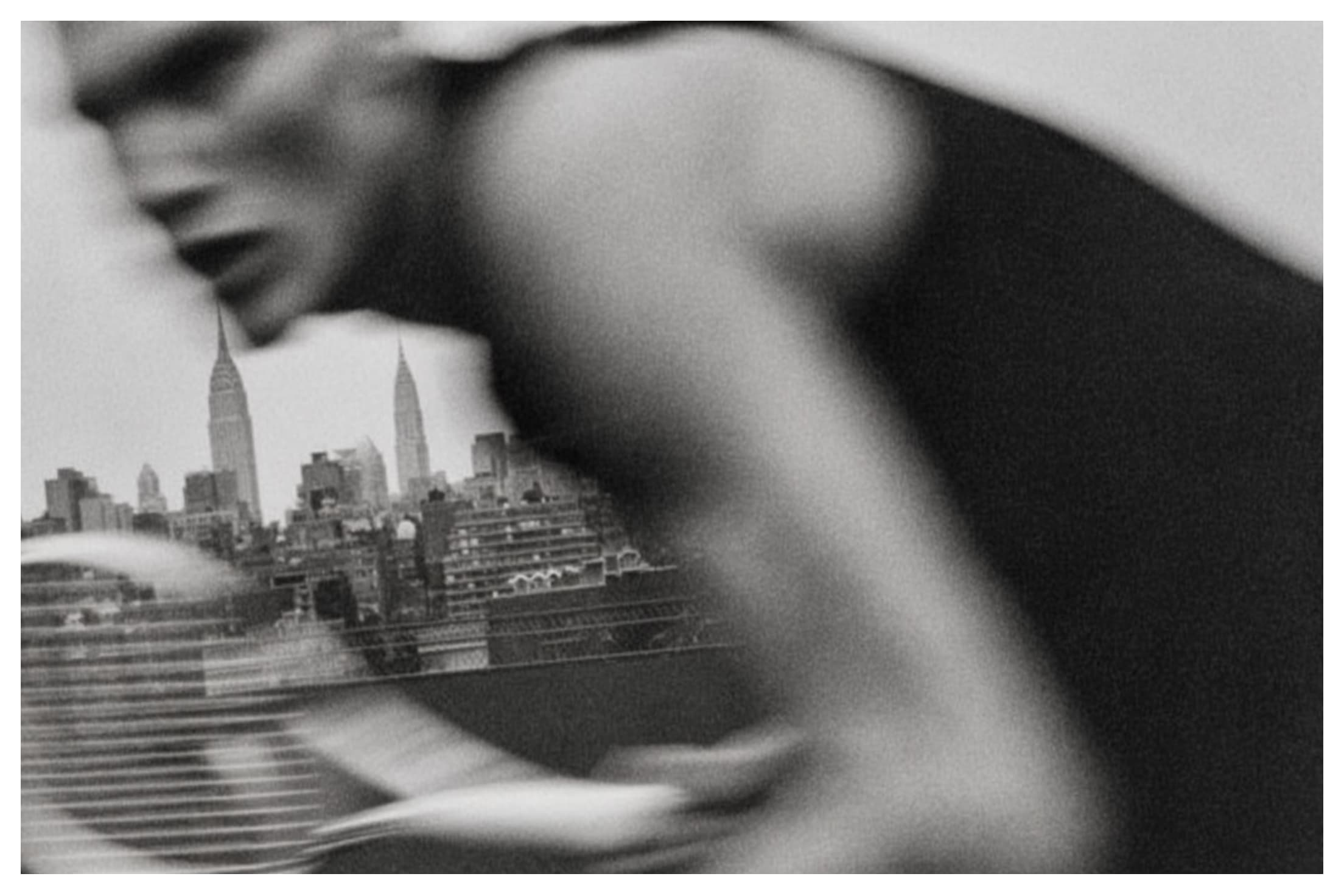
In partnership with Brisas, CityView Racket Club is being reimagined with fresh energy while honoring its legacy. Padel—the world’s fastest-growing sport—joins tennis and squash as a new pillar and social anchor for members. We helped the team visualize the transformation through watercolor renderings of new amenities, including wellness offerings, food & beverage, and flexible spaces for gatherings large and small.
All Stars Tournament Poster
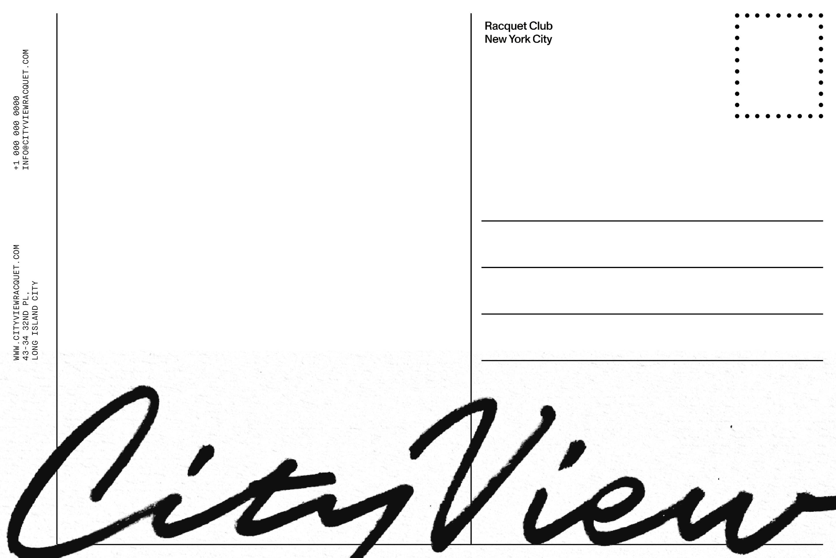
City View Post Card
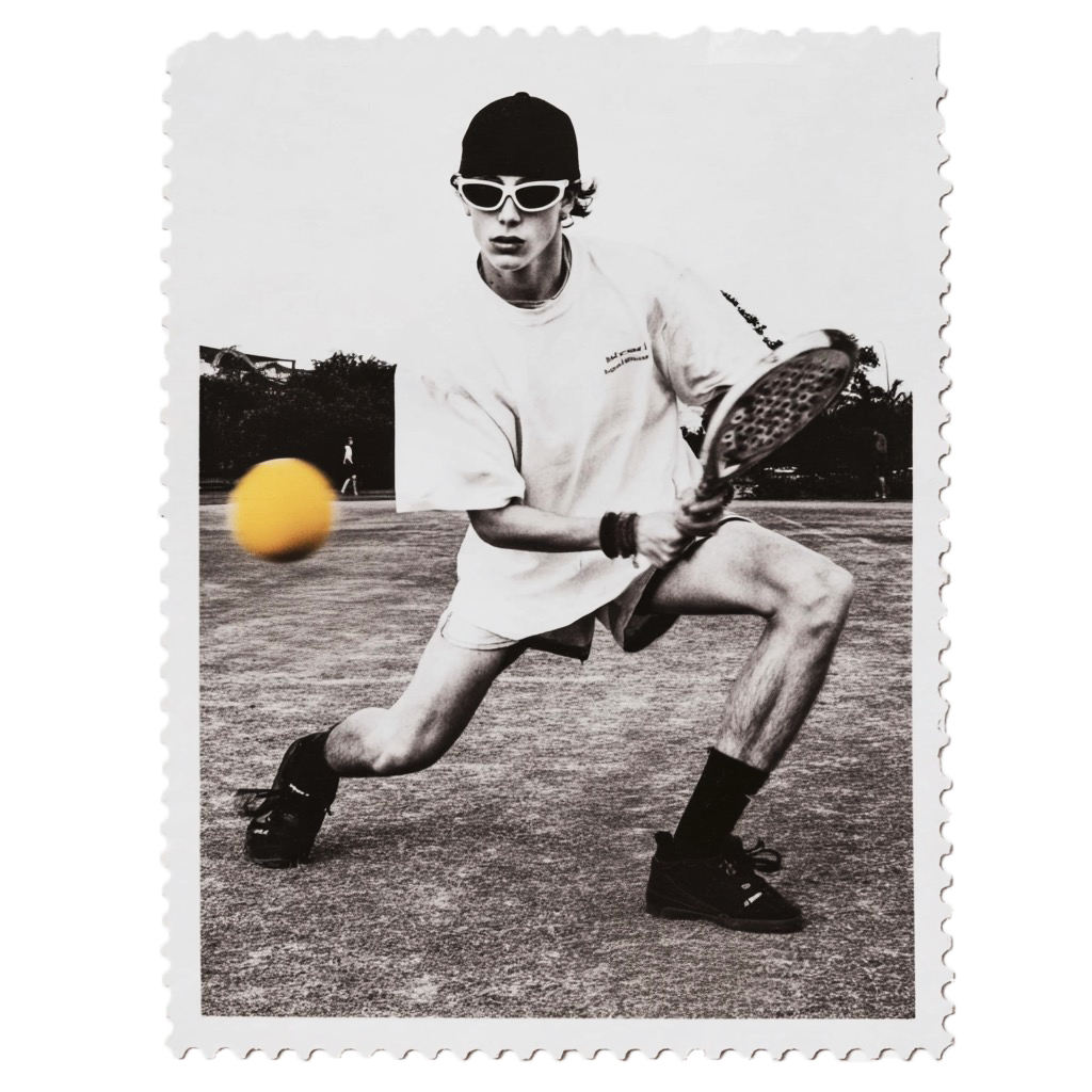
The City's Cup Poster
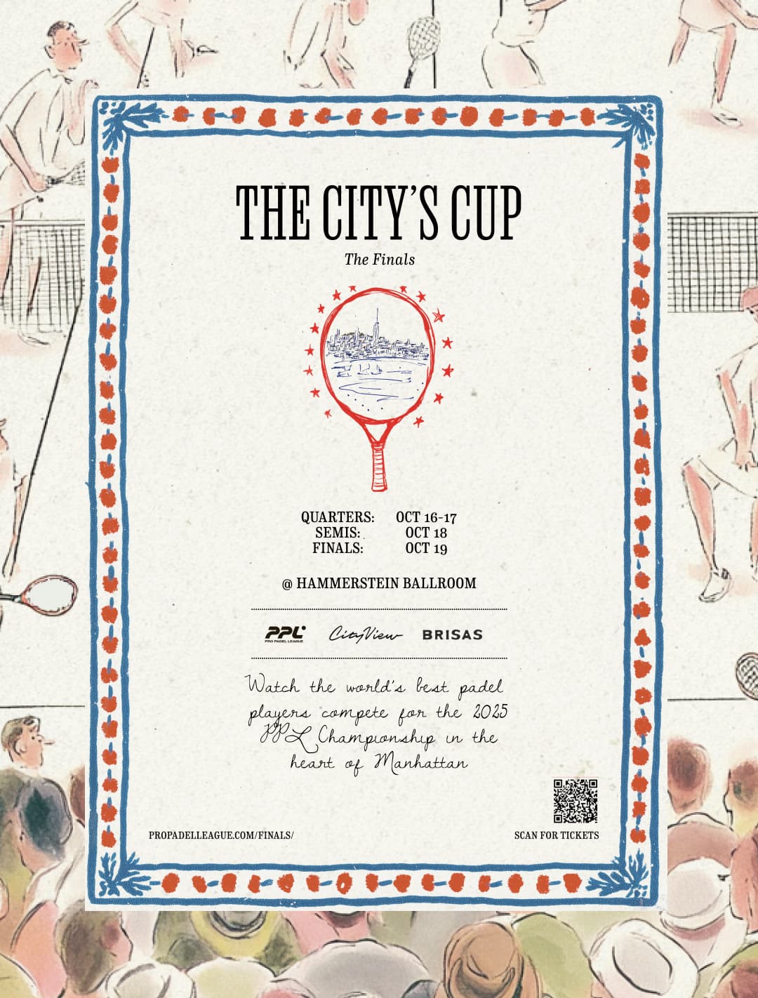
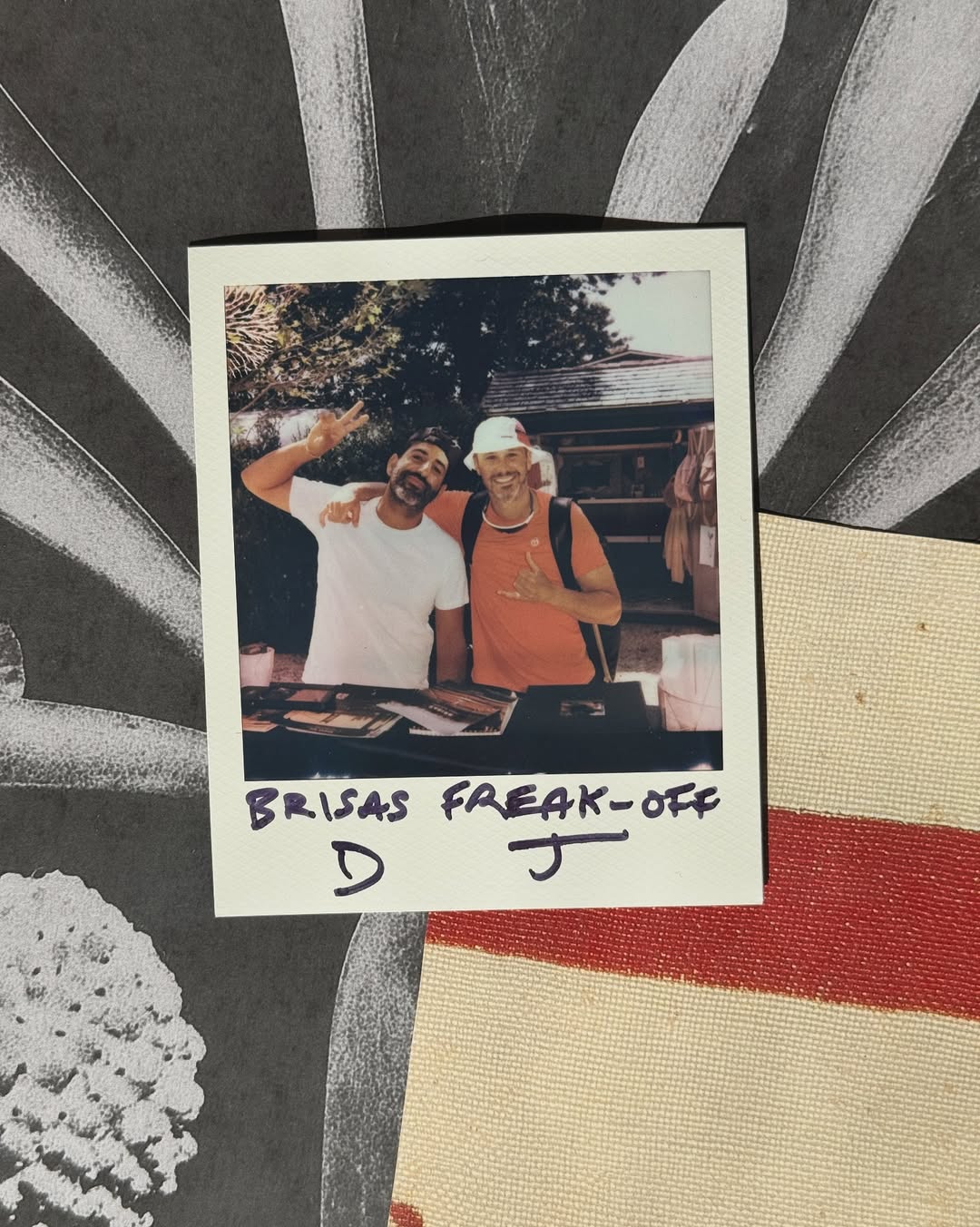
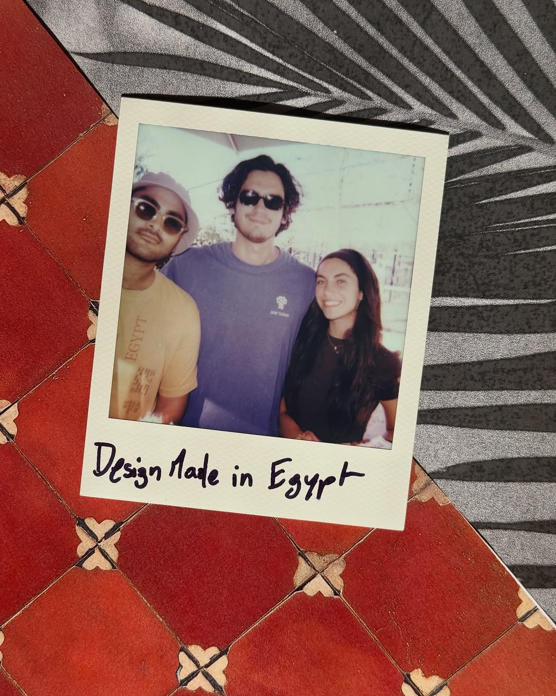
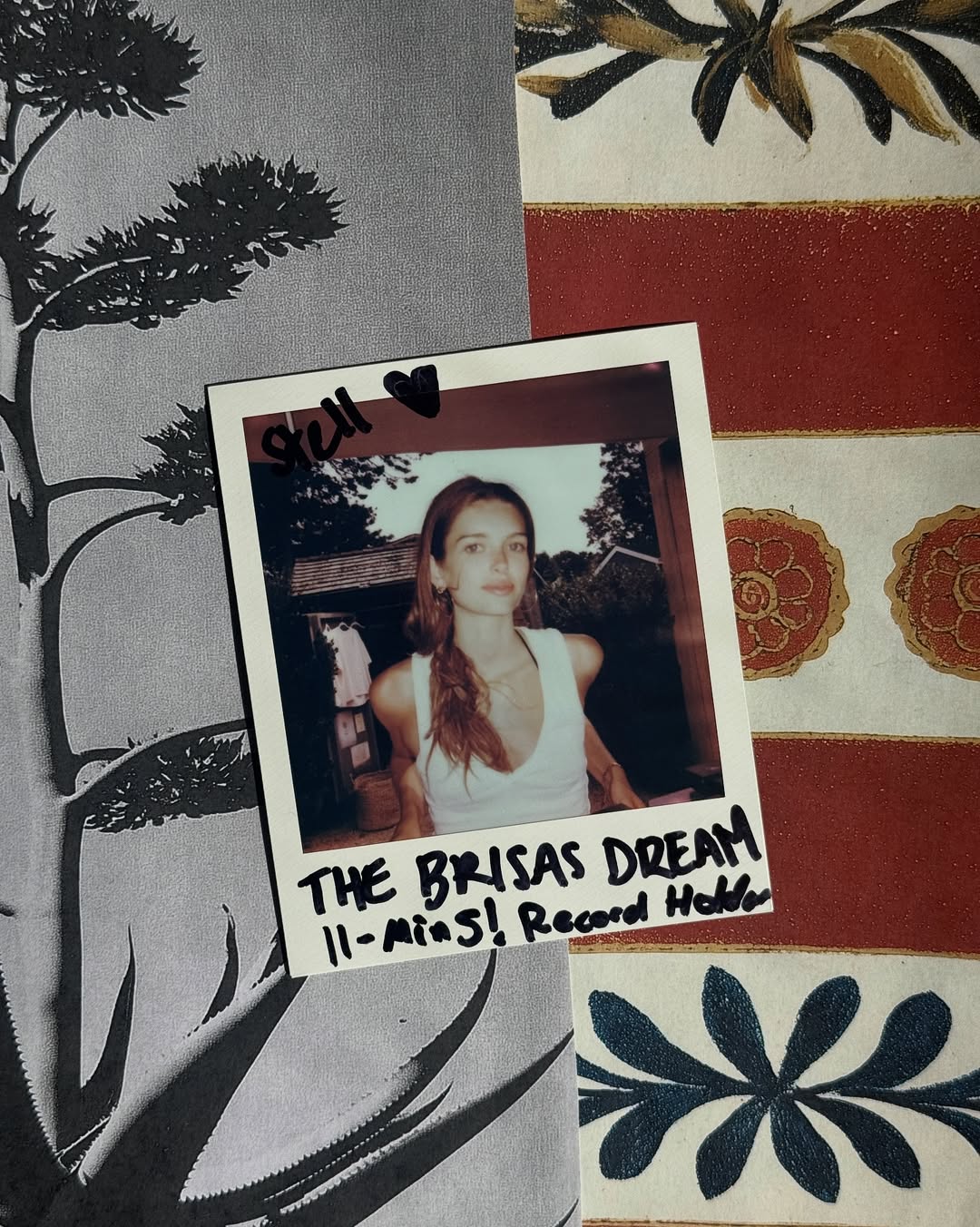
Brisas Summer 2025 Polaroids
Padel Racket Tile Designs


Cafe Wands, visual research & design exploration.
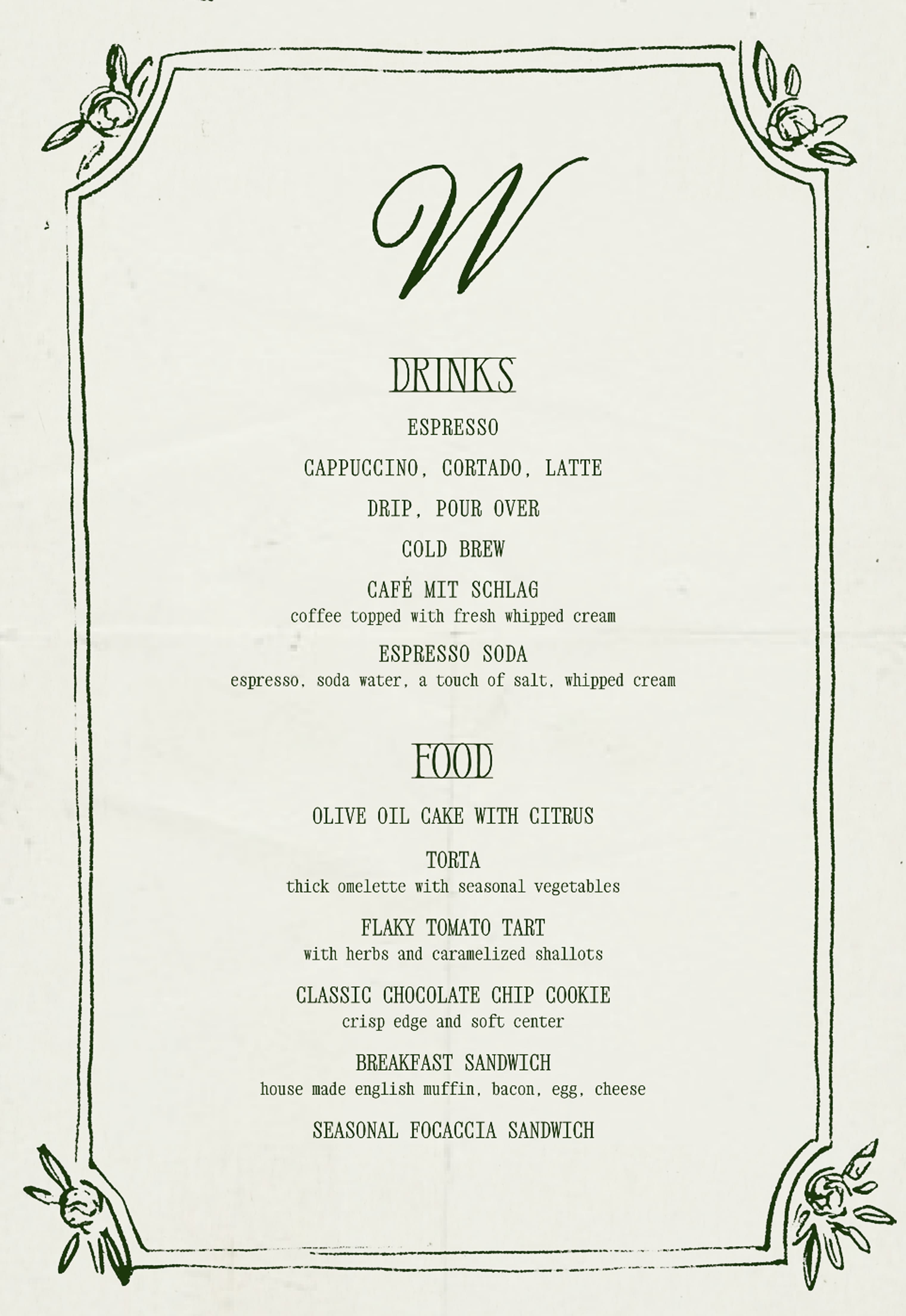
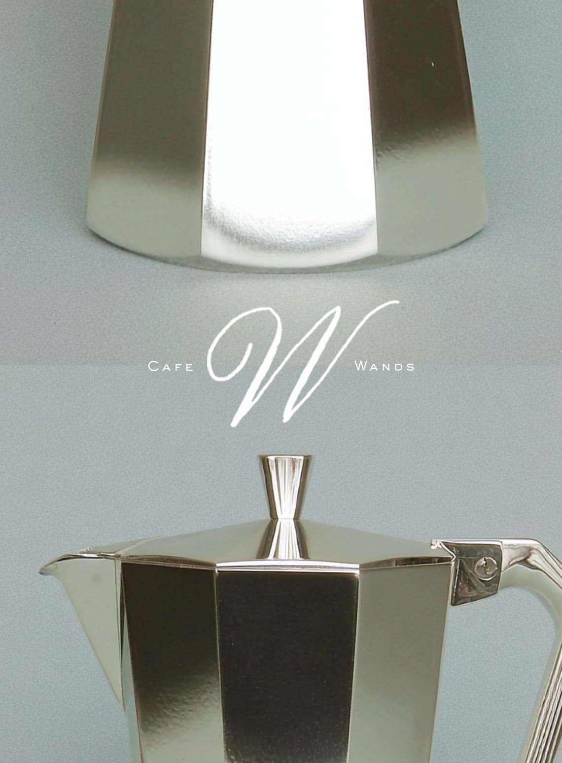
For Café Wands, we’ve begun an initial exploration of how a classic Italian café can exist in Brooklyn Heights today. This direction embraces lived-in, hand-drawn marks, vintage Italian typography, and textured illustration, rather than the generic minimalism seen in many new NYC cafés. The tone is elevated and artistic, yet welcoming for families and everyday rituals. We’re excited to share the beginnings of our research and the opportunity to shape it with you around your vision.
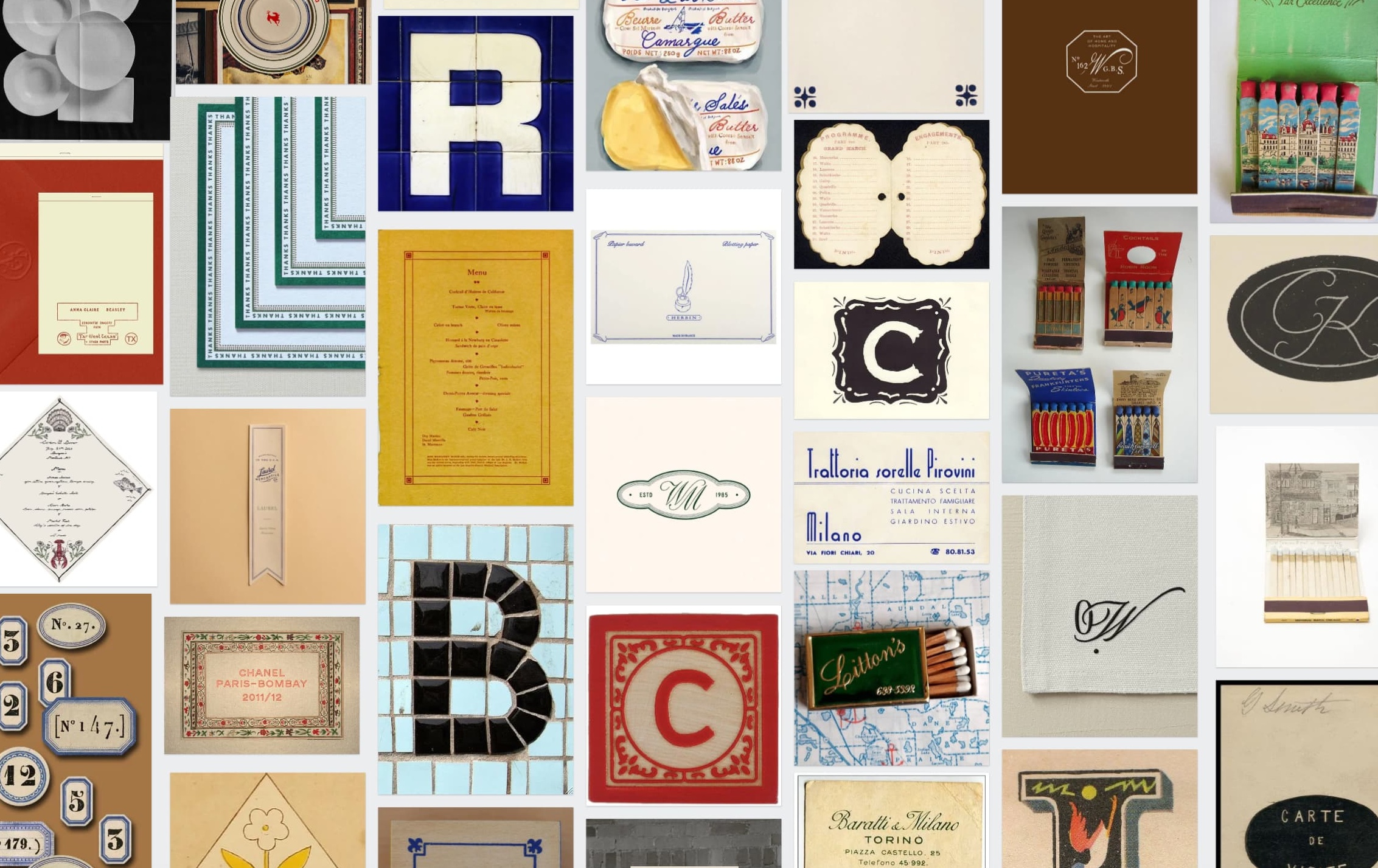
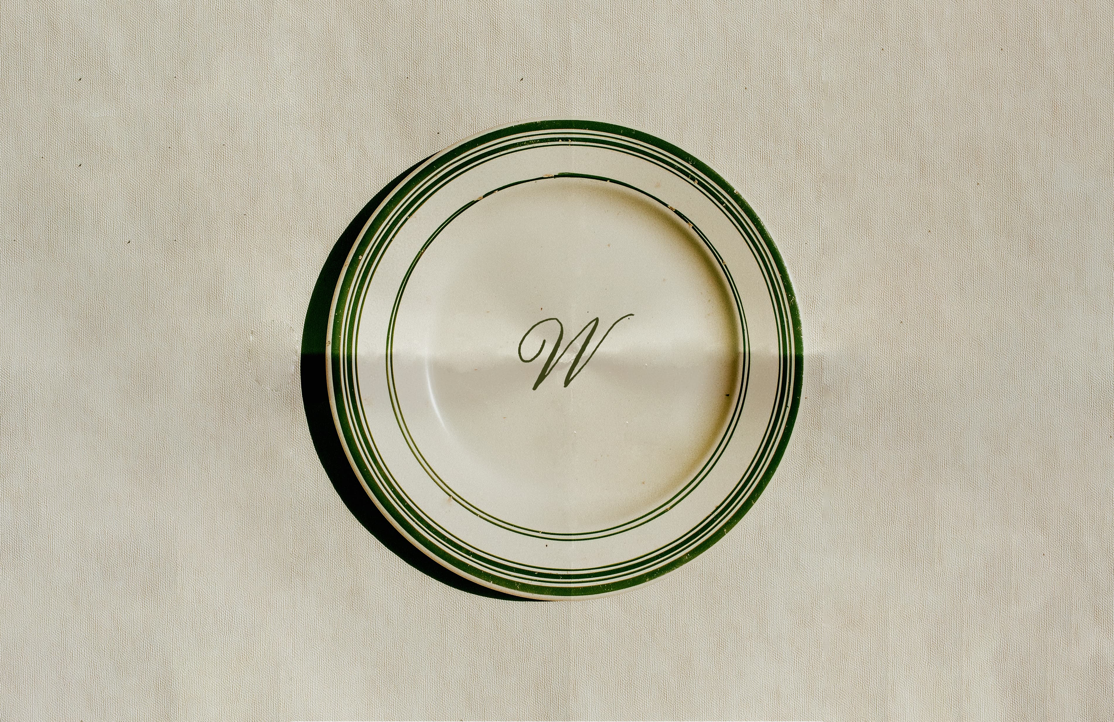
Our graphic and typographic research pulls from vintage Italian café and restaurant ephemera — menus, matchbooks, receipt stamps, monogram seals, and tiled letterforms. These references use elegant typography, ornamental borders, and rich paper textures, creating a visual language that feels heritage-driven yet modern and elevated.
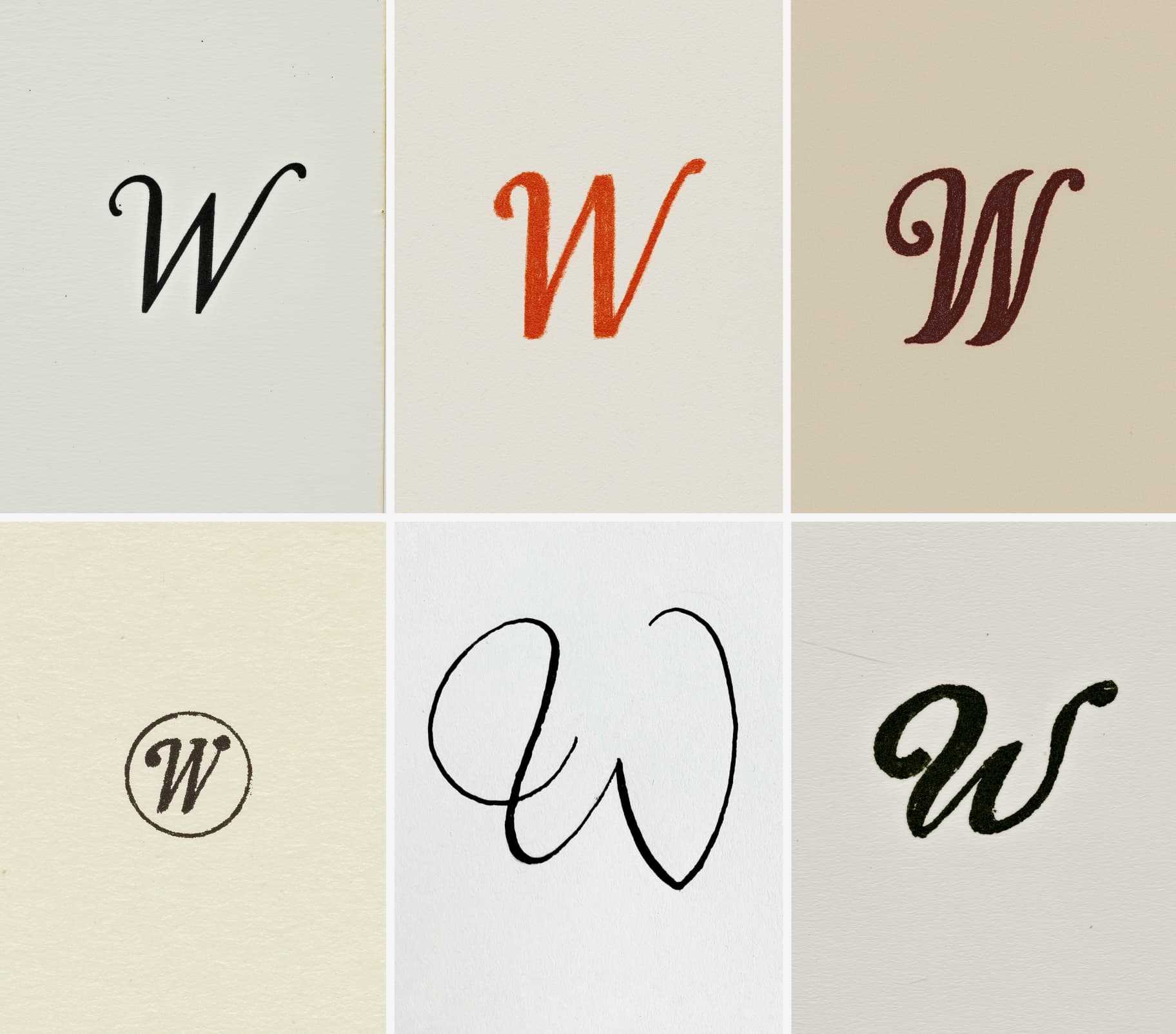
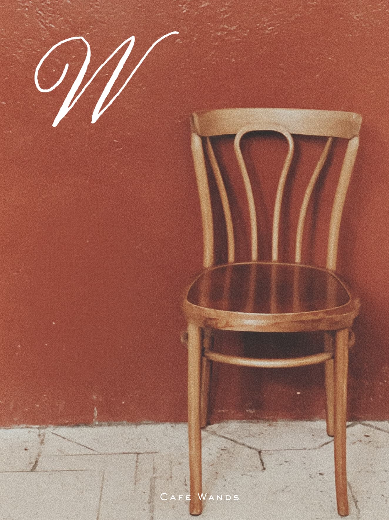
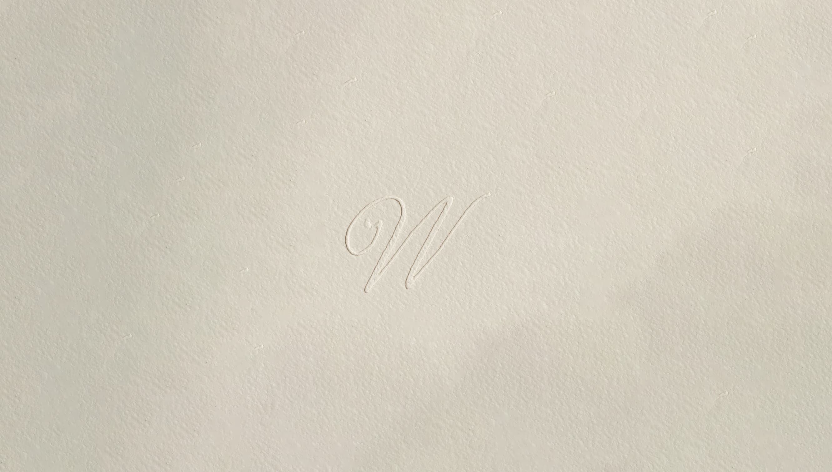
The W can become a symbol for the cafe. Whether embossed on a napkin, stamped on a matchbook, or printed on takeaway packaging, the symbol feels instantly recognizable, even when rendered in different styles. We have began exploring process variations — from inked monograms to loose handwritten forms and more ornamental letterpress-inspired cuts.
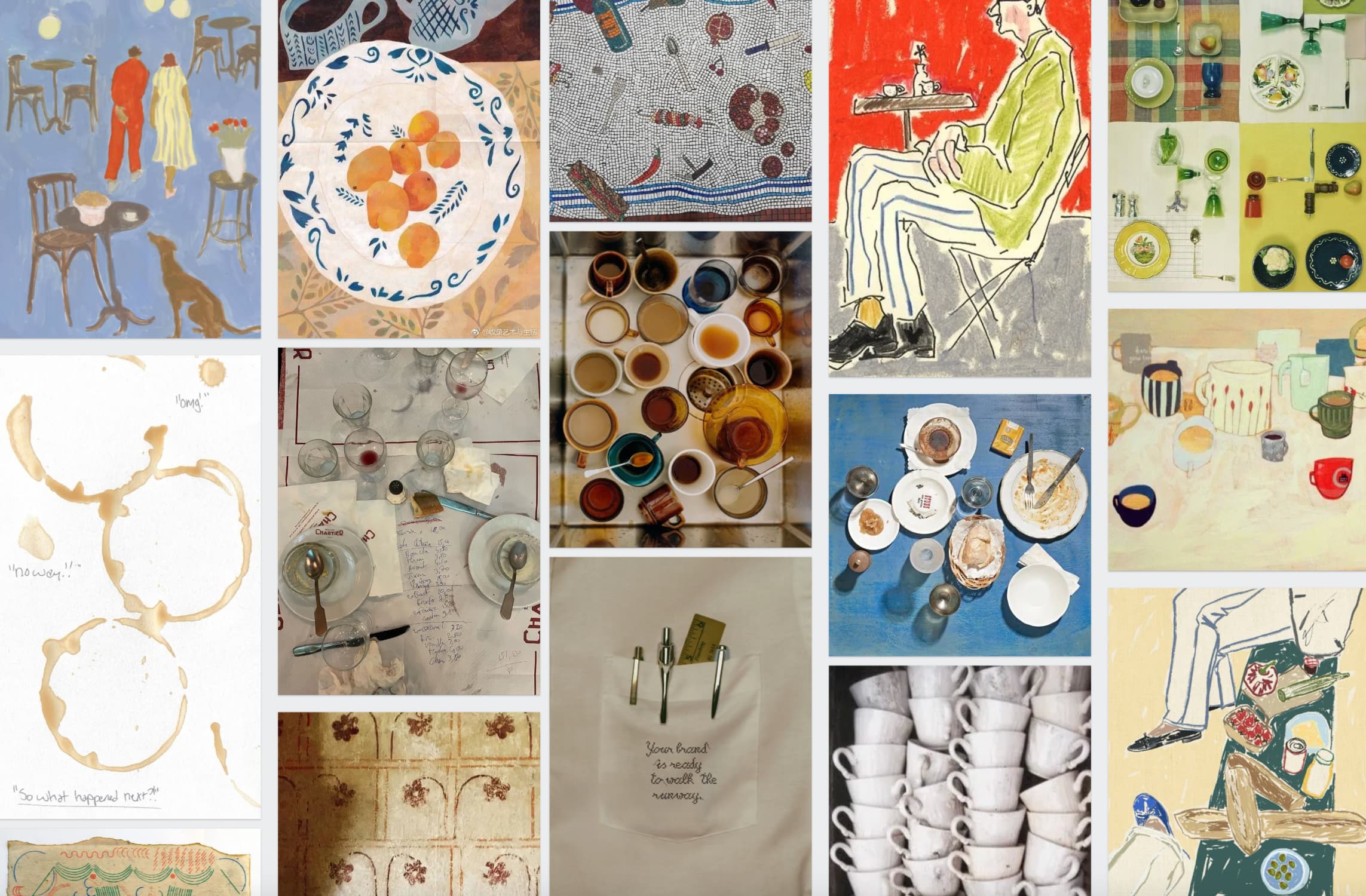
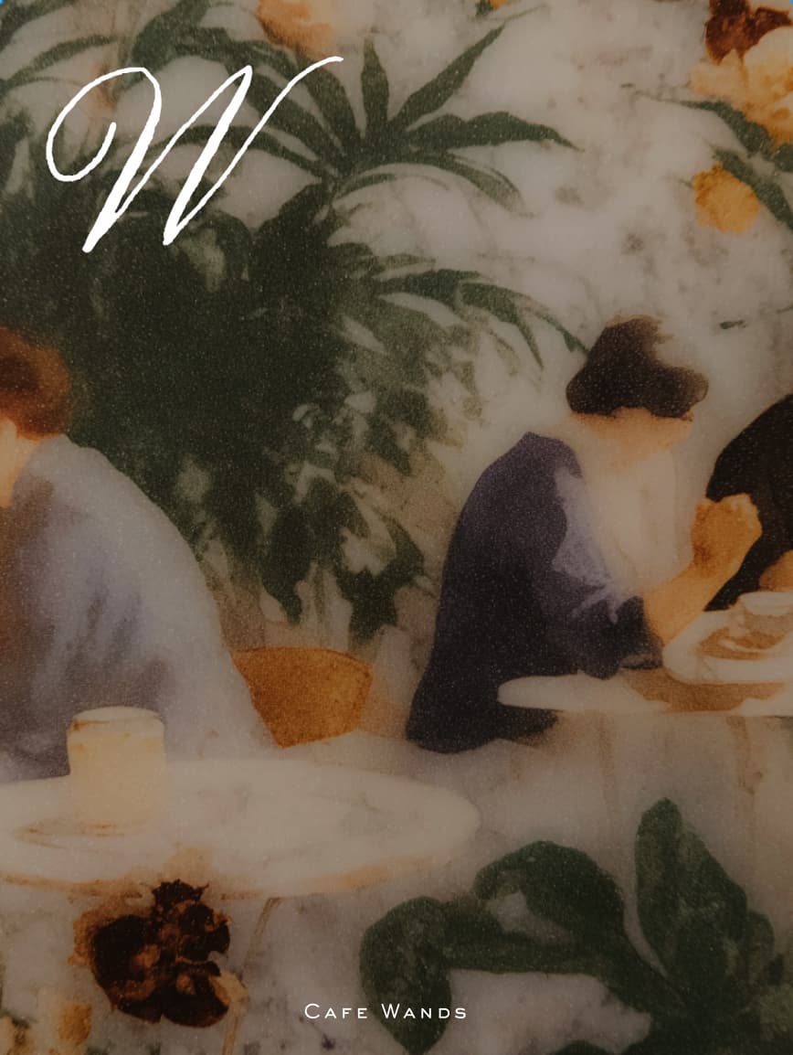
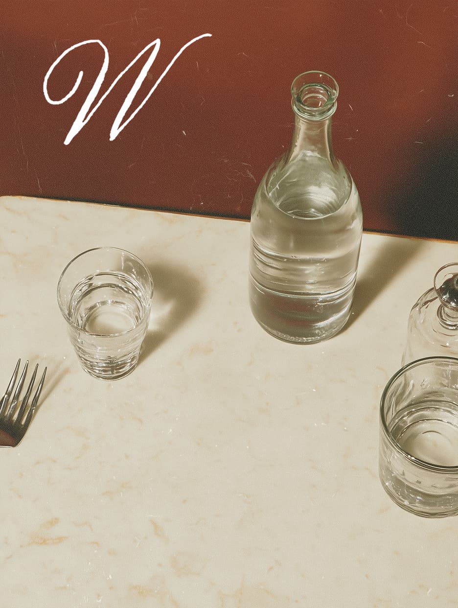
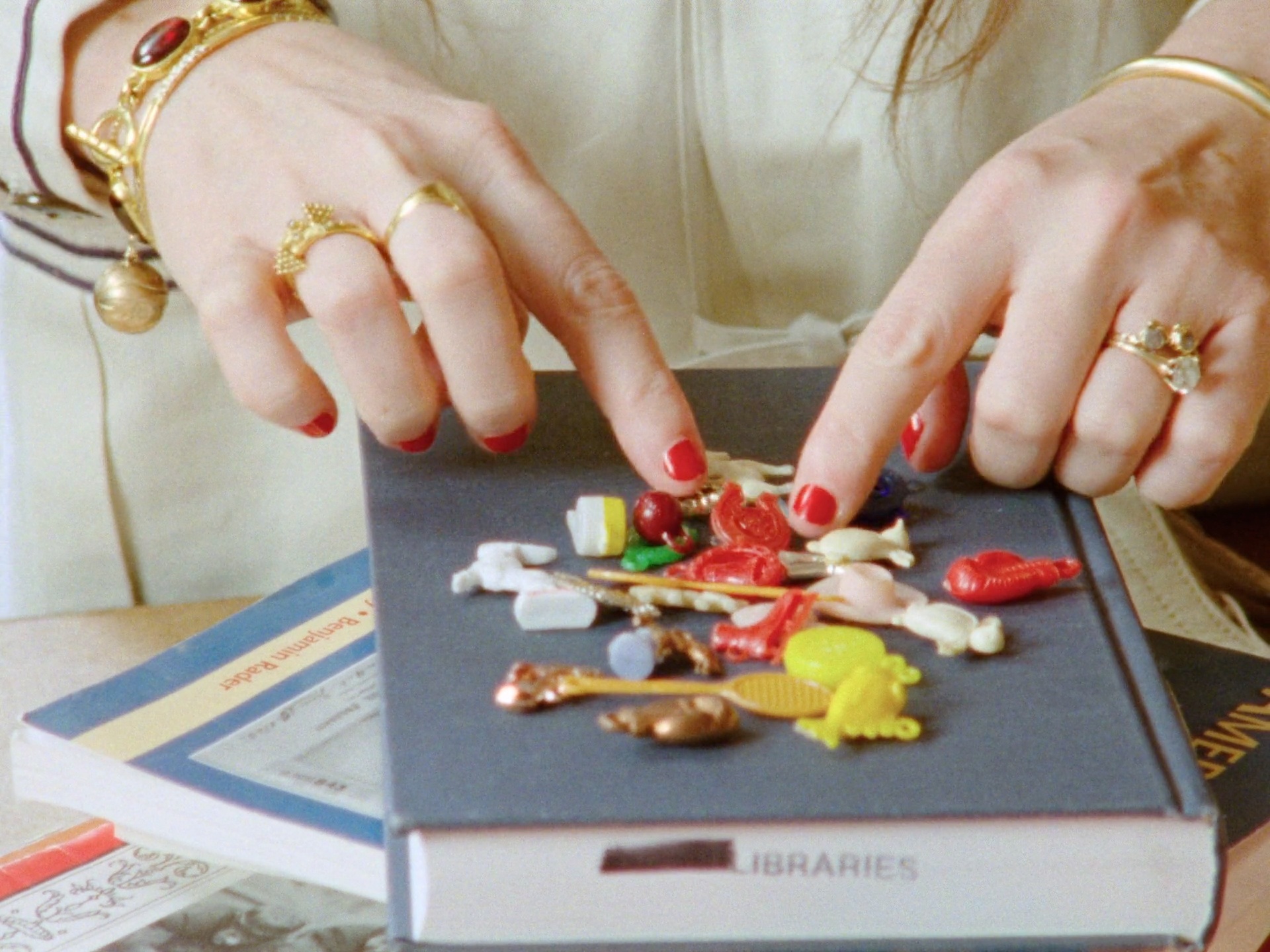
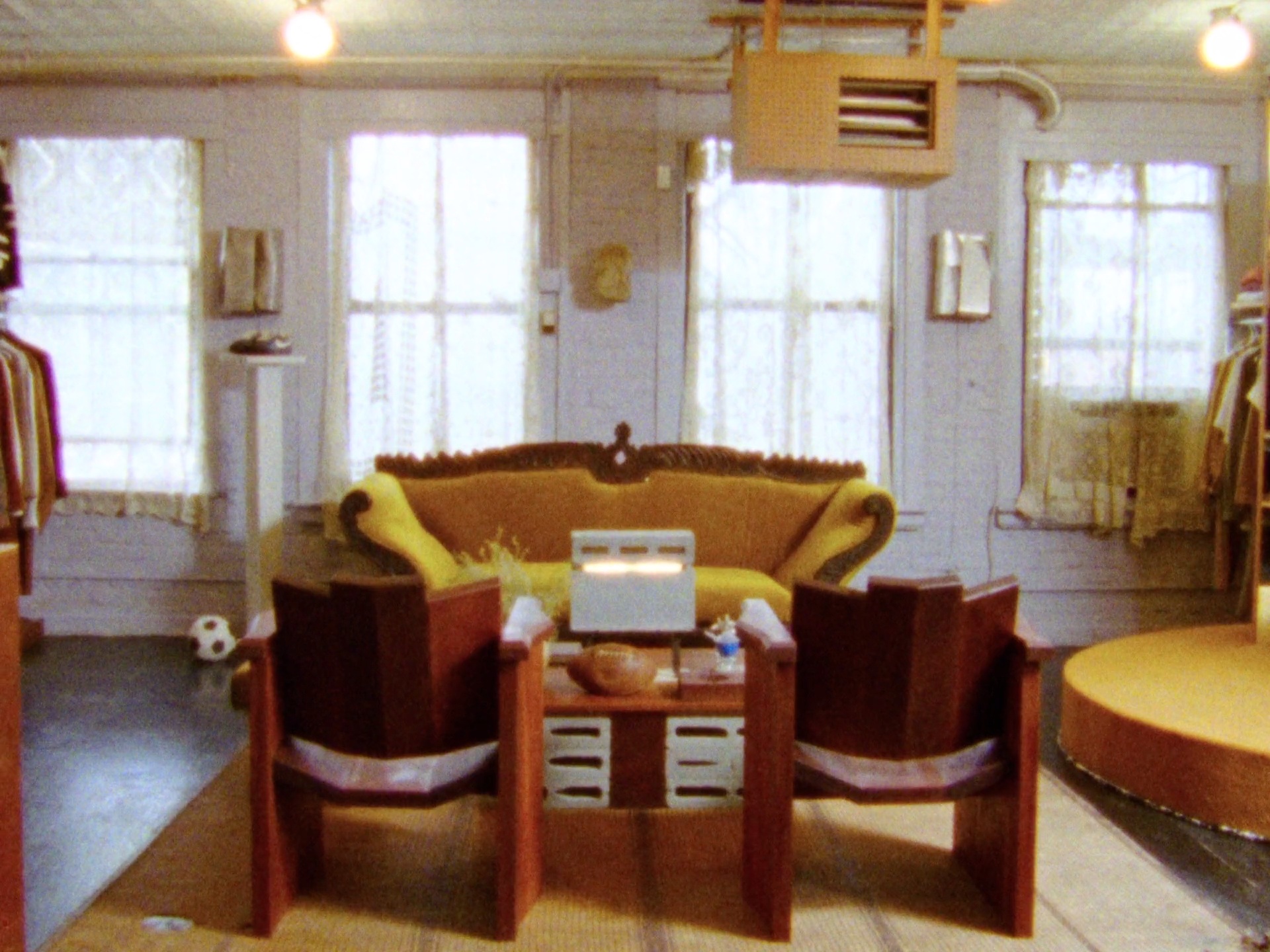
We are interested in lived-in spaces — environments that hold evidence of use and human presence, rather than styled perfection. These small traces and imperfections tell stories: a coffee ring on wood, frayed paper edges, handwritten notes, a towel thrown over a chair. By bringing textural elements and tactile materials into the visual language, the world feels human, real, and emotionally grounded — not sterile or overly curated.
When paired with imagery, the W monogram begins to anchor a full visual world. The combination of vintage tonal palettes, painterly textures, and quiet still-life moments gives the café an atmosphere that feels nostalgic yet surprisingly modern, almost like a magazine editorial set in a real neighborhood café.The imagery is not glossy in a commercial way — instead, it feels observed, cinematic, like scenes captured in between moments.
Cafe Wands, visual research & design exploration.
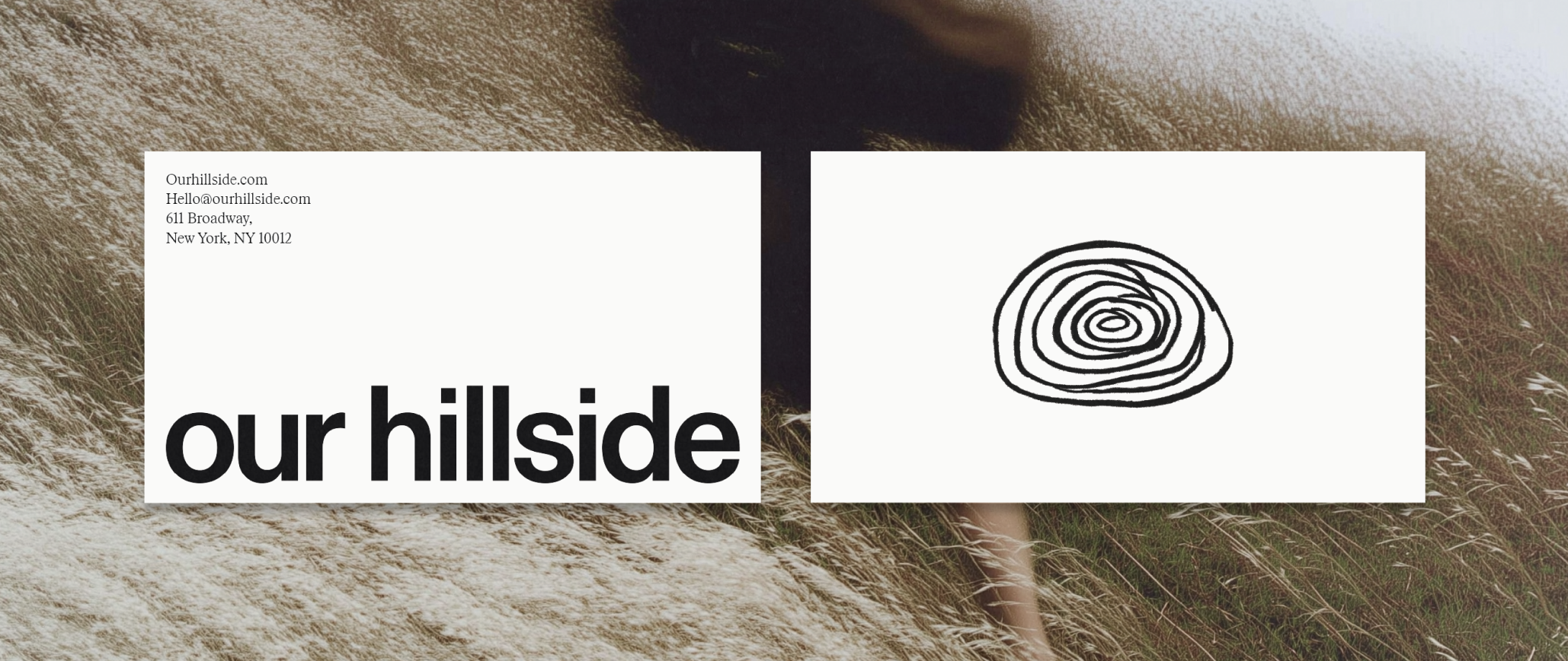
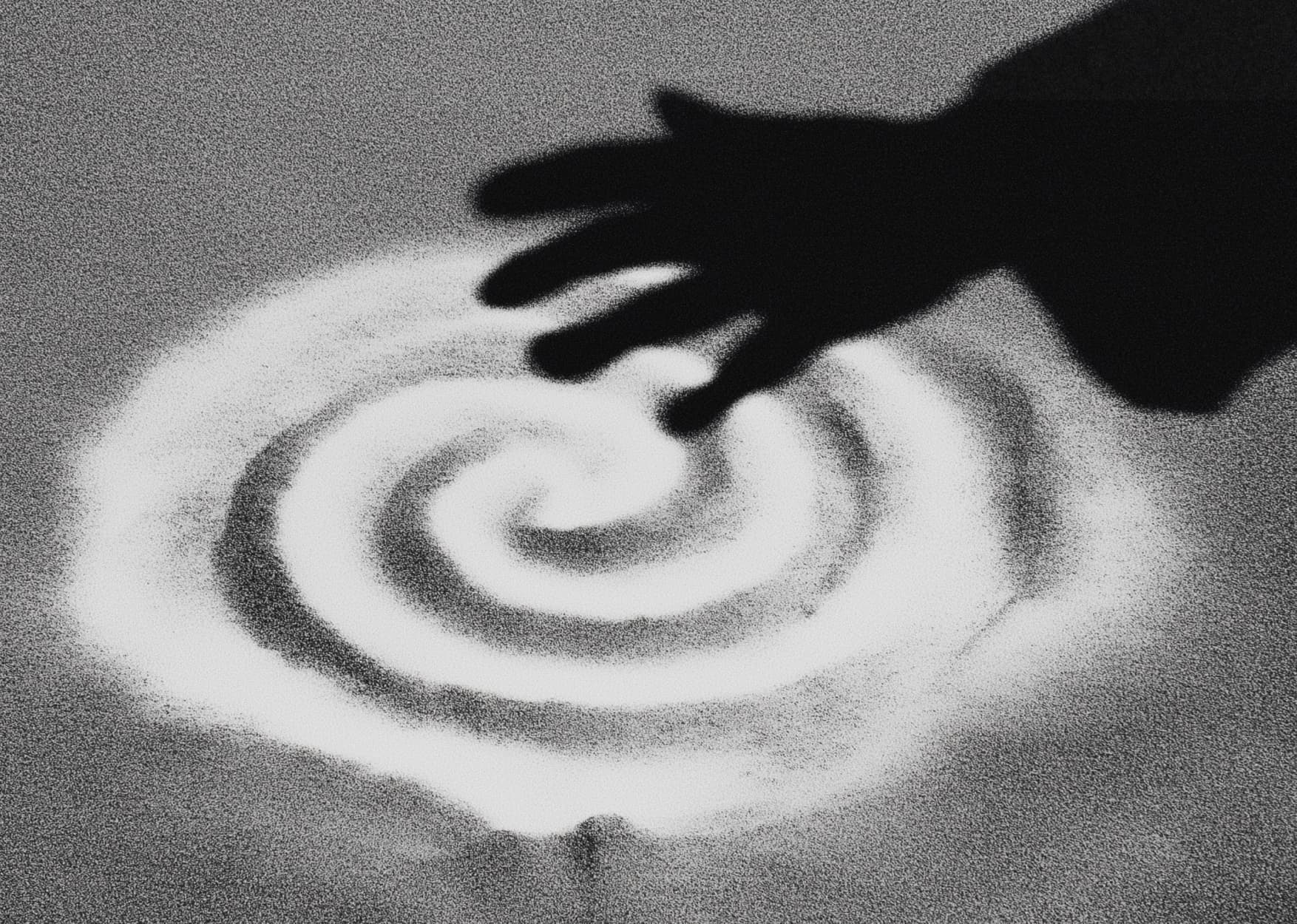
When you stand on our hill, we welcome you. Lift you higher, inviting you to see the world from a new vantage point. From up here, everything changes. The view is broader, clearer, filled with endless possibilities. Our hillside is a tribute to those moments when we stand on the edge of something greater—when we pause, breathe, and see beyond what we thought was possible. It’s the rush of a rollercoaster, the spark of a fresh idea. The nostalgia of scraped knees from tumbling through dew-kissed grass. The hill whispers the timeless truth of life: to rise, to let go, to be fully present through the peaks and valleys of all of life’s journeys. It’s where we grow, where we dream, where we rise. Our Hillside.
Cafe Wands, visual research & design exploration.
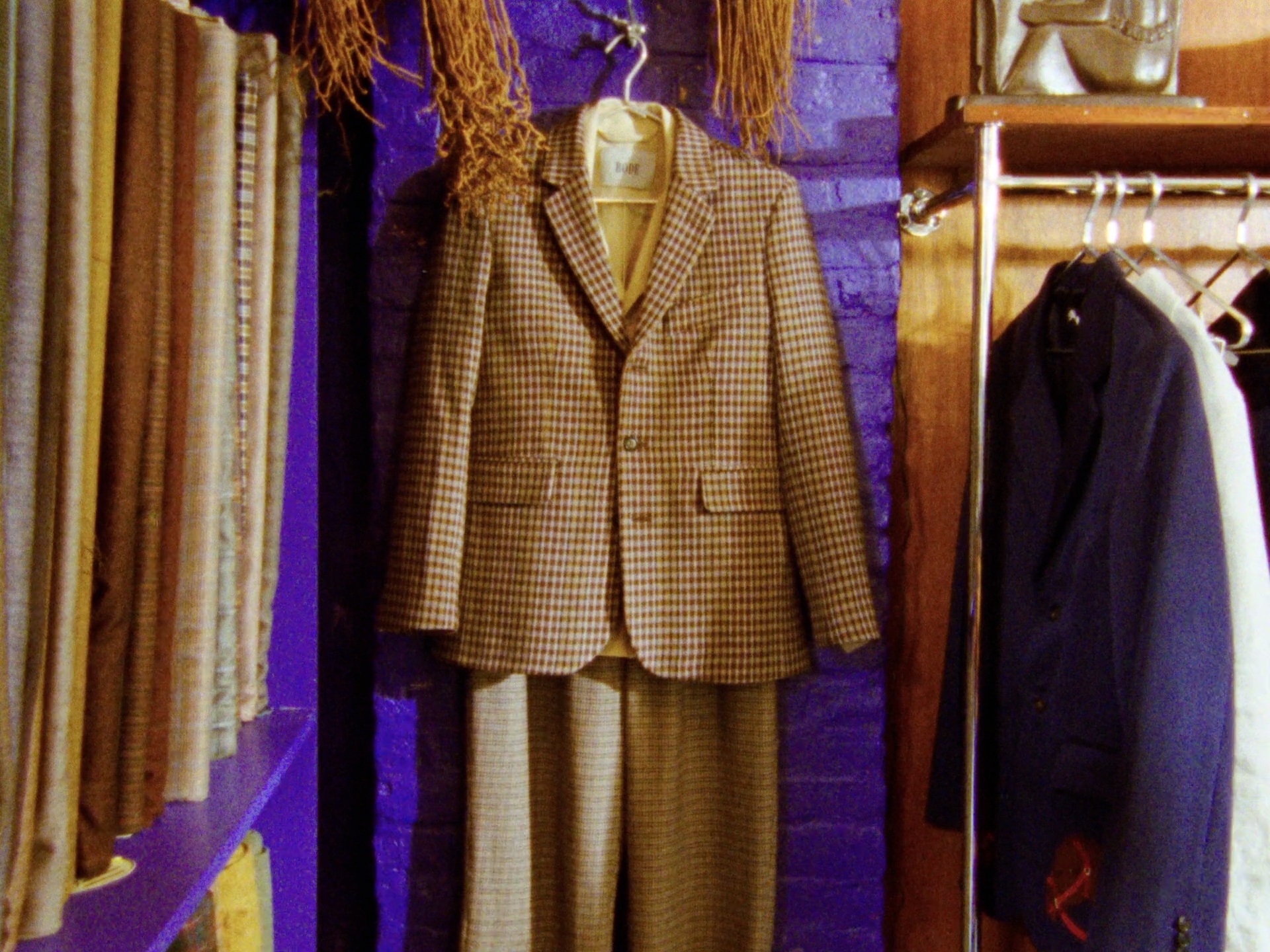
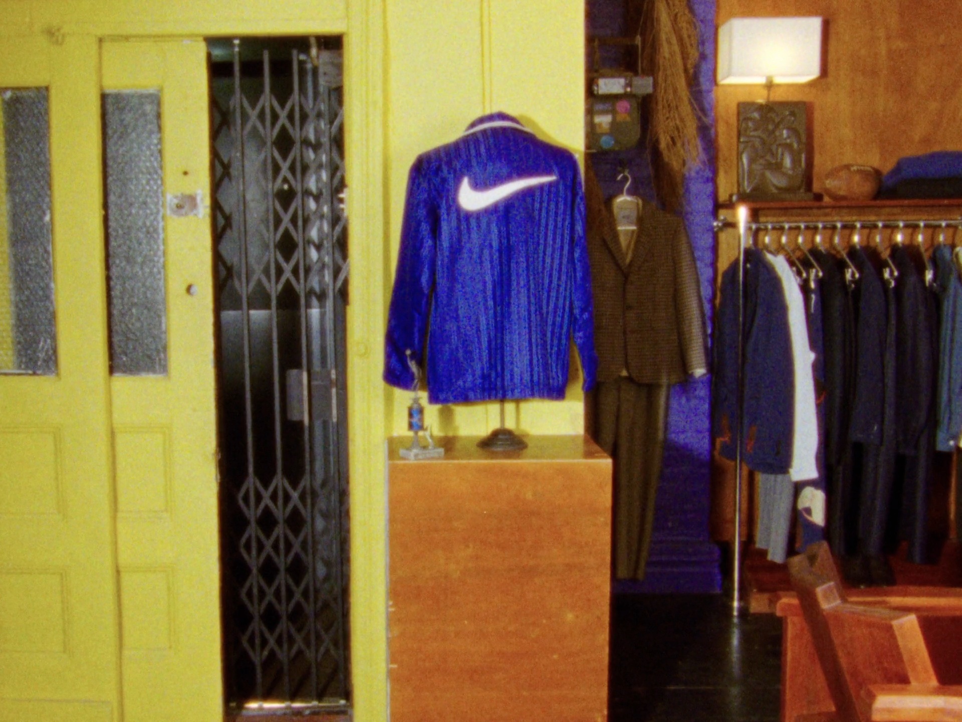
“So much of Bode is around my love and understanding of collecting and how that led me to be the person I am today. I’m Emily Adams Bode Aujla, and I’m the founder and designer of Bode.” The Bode Rec. design ethos explores the evolution of athletic wear and character-building through the lens of American institutional sports and competition, aiming to reshape how we understand our collective cultural heritage. That vision comes to life in the first Bode Rec. line and Nike collaboration. Emily Bode Aujla draws inspiration from her father’s deep connection to team sports, the pride of student-athletes and its impact on community, and Nike’s dedication to innovation, athlete feedback, and the legendary coach-athlete bond between Bill Bowerman and Phil Knight.
The original Astrograbber sketch
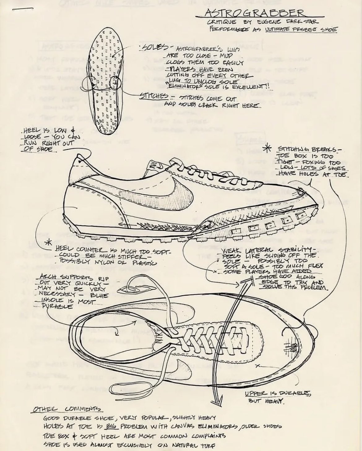
Revived with Bode Rec., the Astrograbber returns from Nike’s 1974 archives. The shoe was a purpose-built turf shoe that adapted the new waffle outsole for AstroTurf—an early icon of Nike’s innovation era. We transformed the original Astrograbber sketch into a moving blueprint.
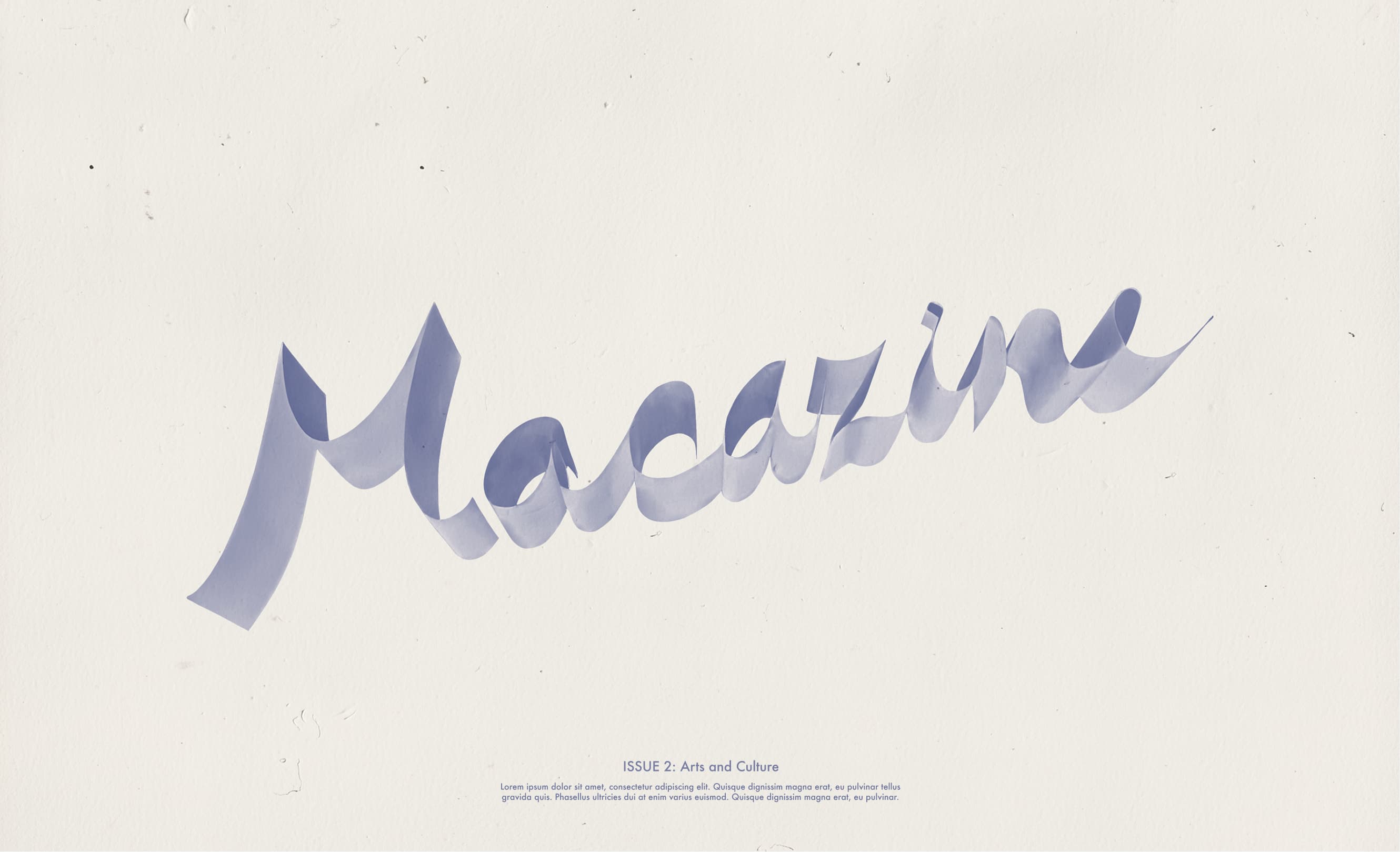
Macazine - music, art, cinema, & architecture
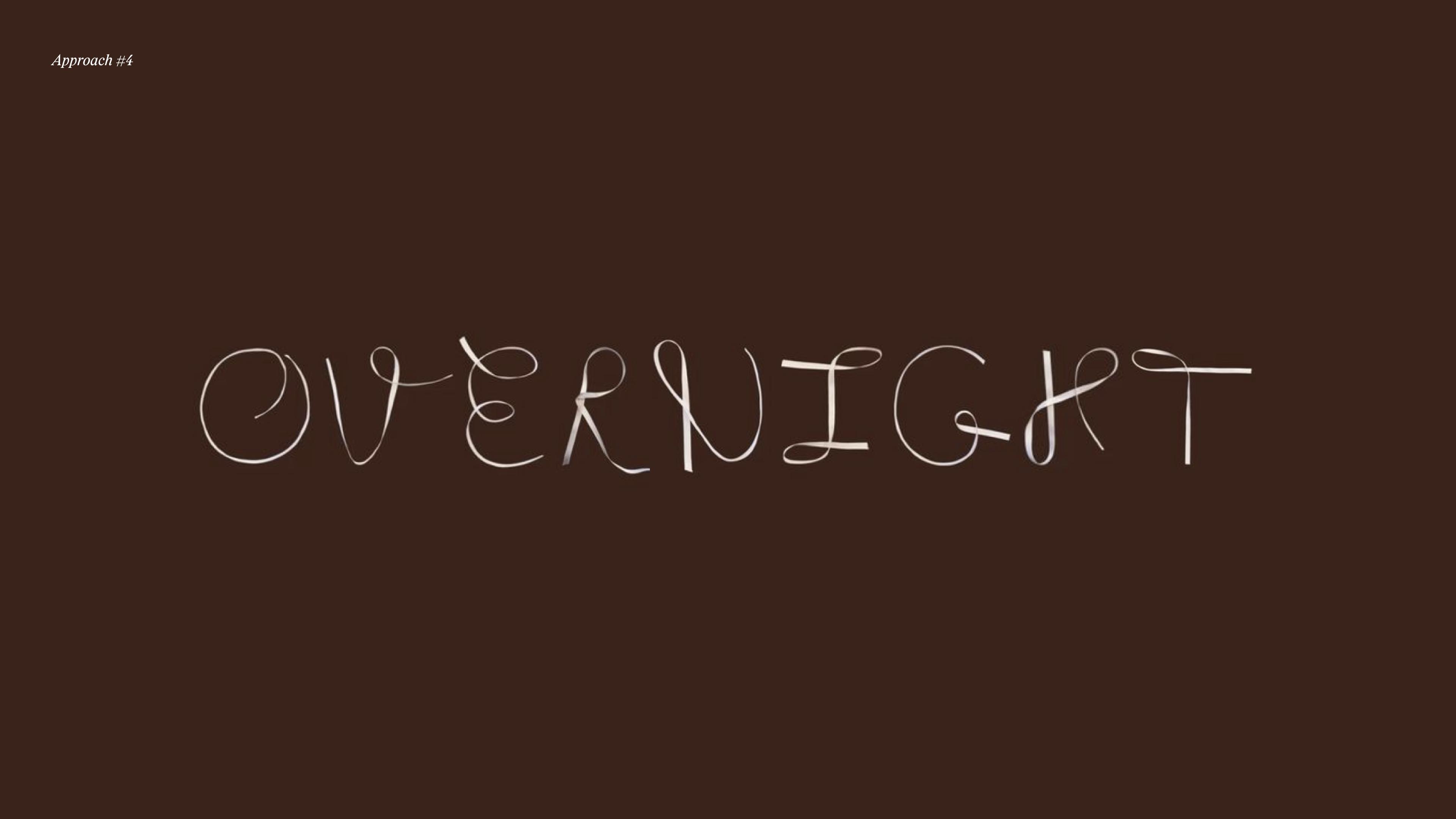
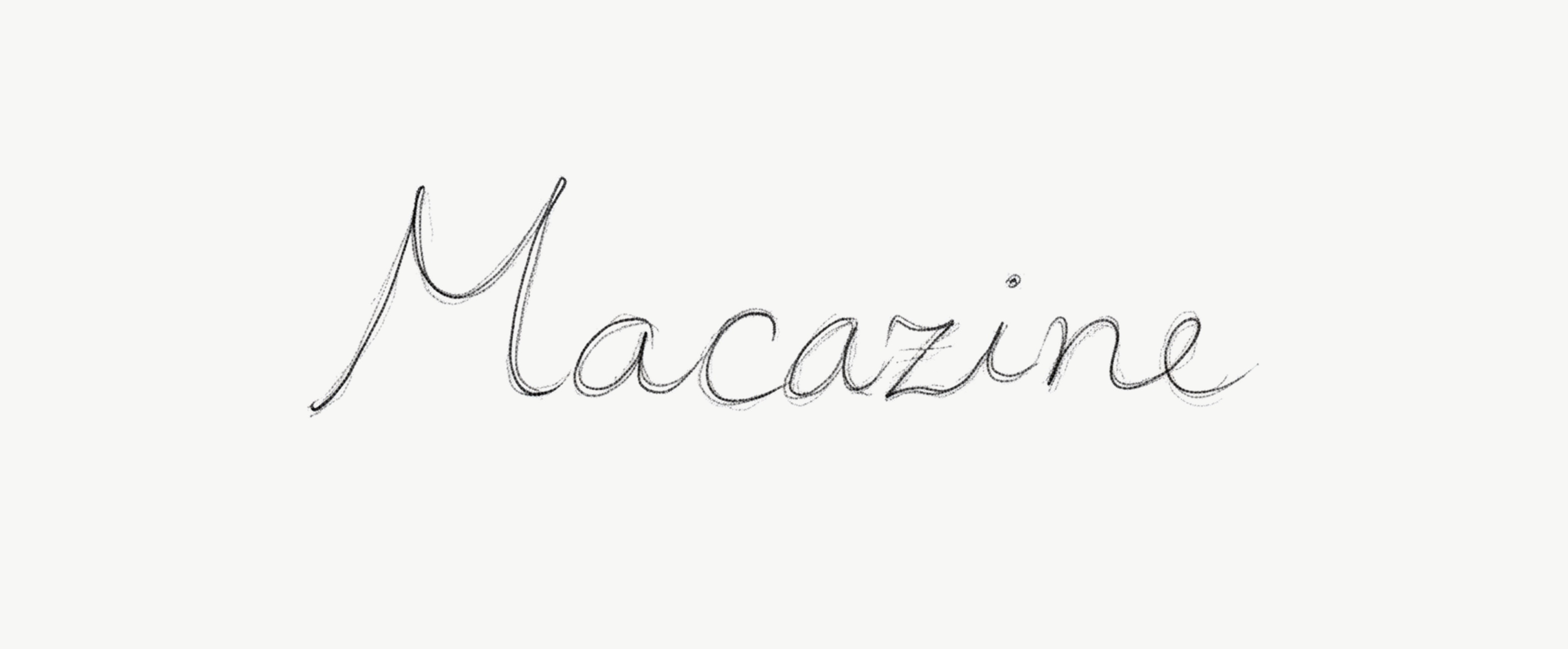
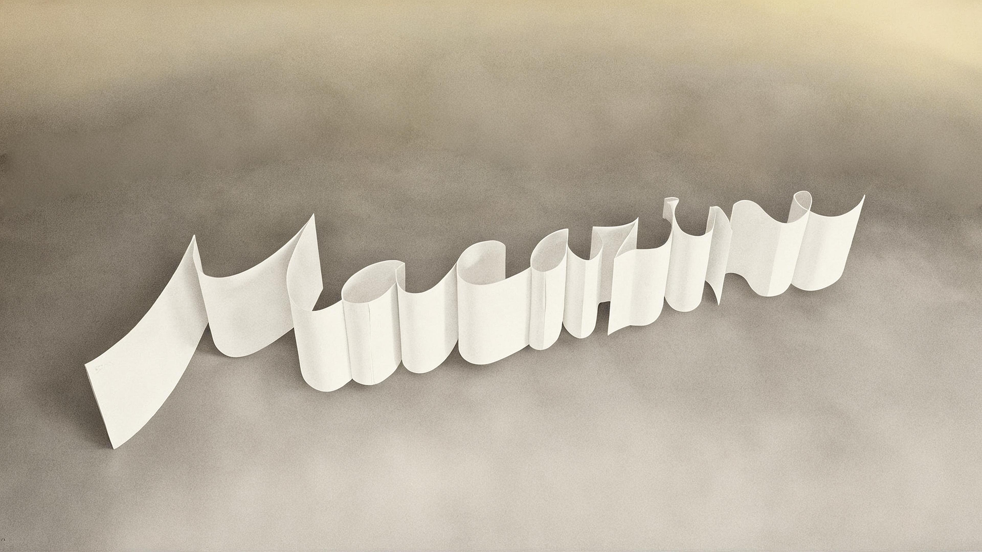
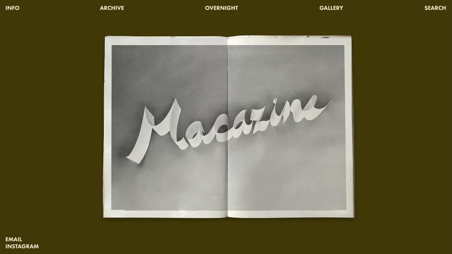
Logotype and identity proposals for Macazine, by Cristina Macaya. An homage to Ed Ruscha’s Ribbon Words, the mark aligns Macazine with a lineage of conceptual image-makers that questioned how words and images operate visually, culturally, and emotionally.
Logo + Secondary font in use
Letterform Sketch
Overnight with Cristina Macaya.
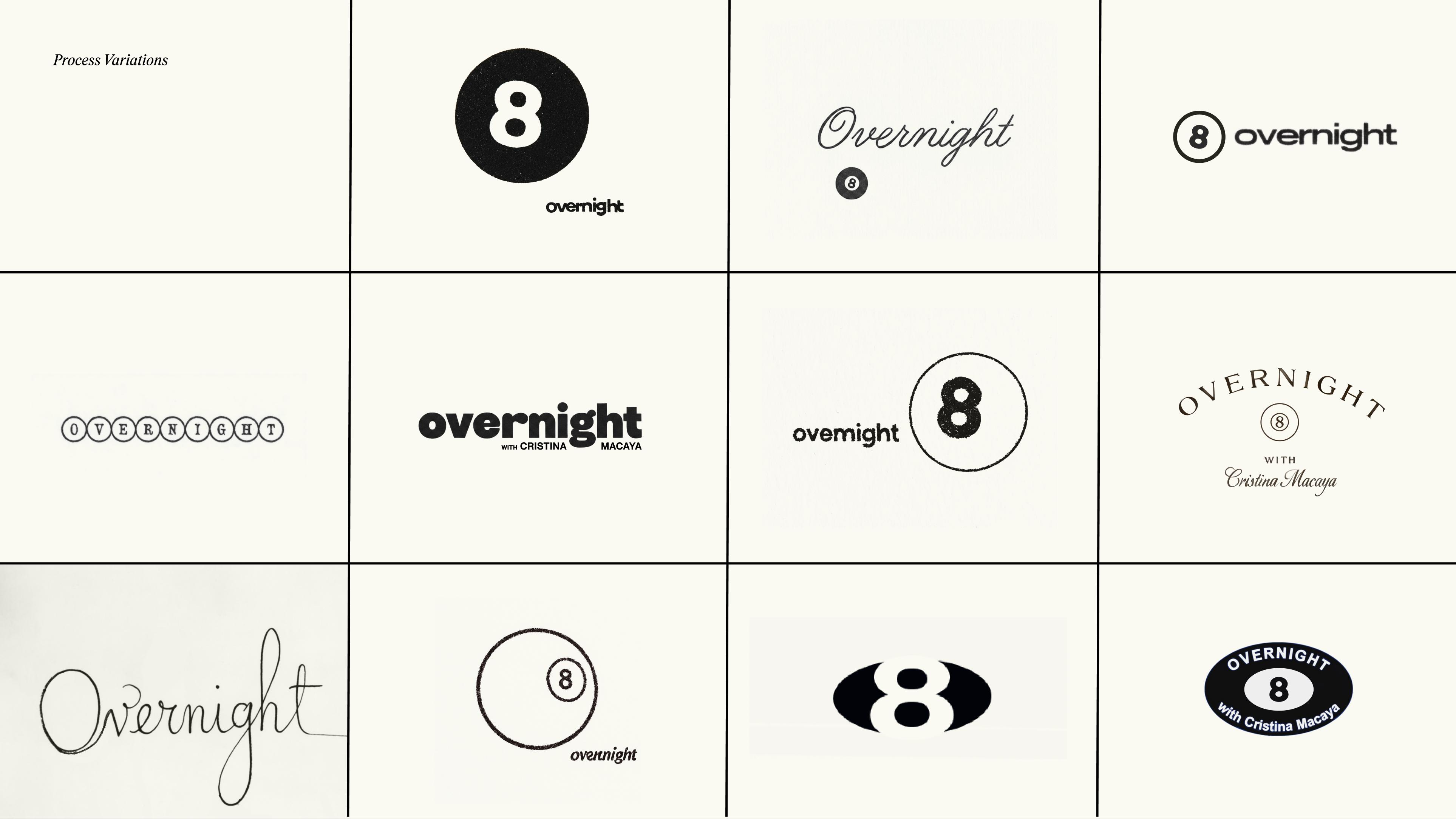
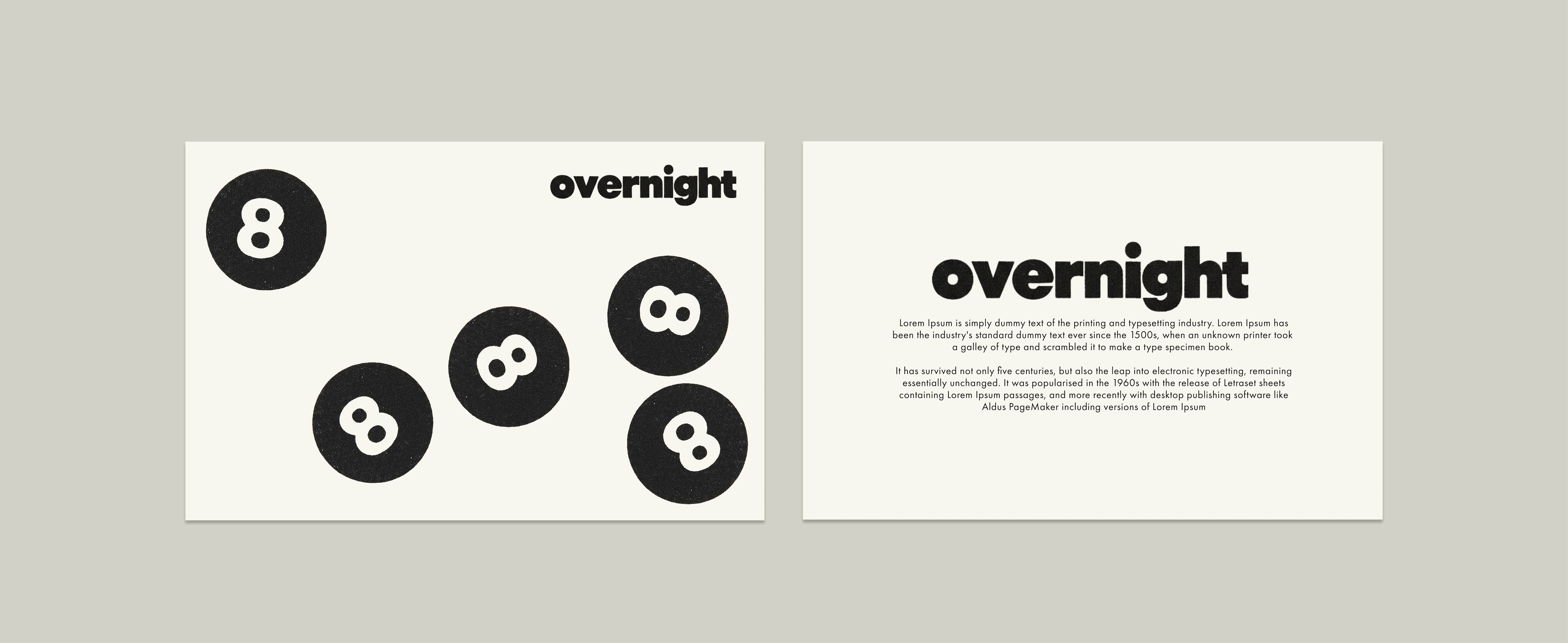
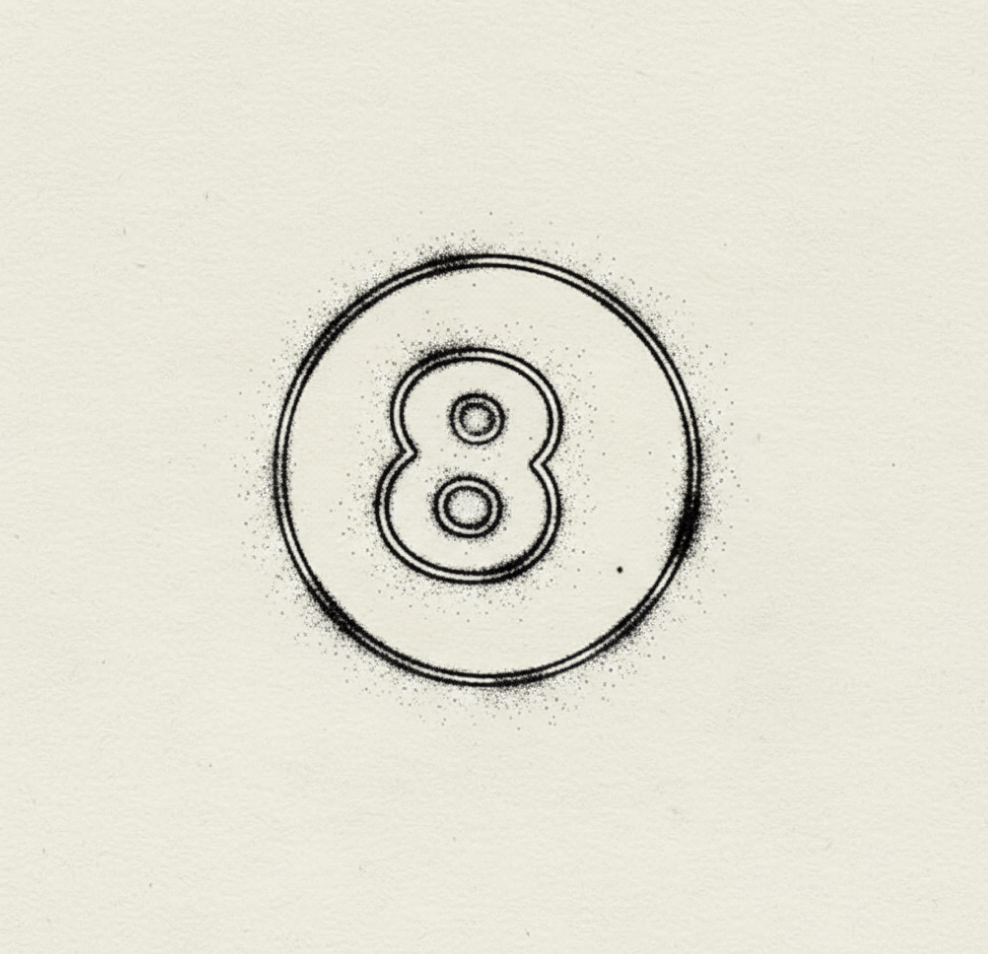
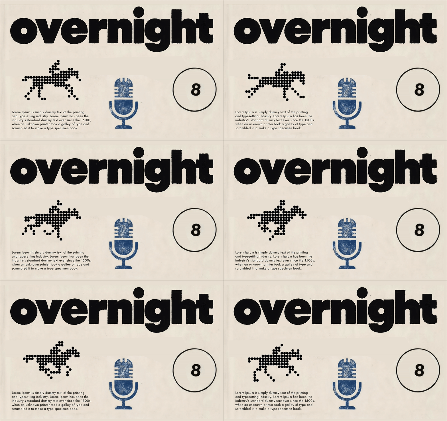
Logotype and identity proposals for Overnight, a podcast by Cristina Macaya. The direction takes a modernist approach, drawing from the graphic language of vintage print and broadcast design from the 1950s–70s. We leaned into the physical world—paper textures, ink bleeds, and hand-stamped marks—to create a tactile, lived-in visual system. The 8-ball functions as a recurring brand motif, anchoring the identity with a playful but iconic symbol.
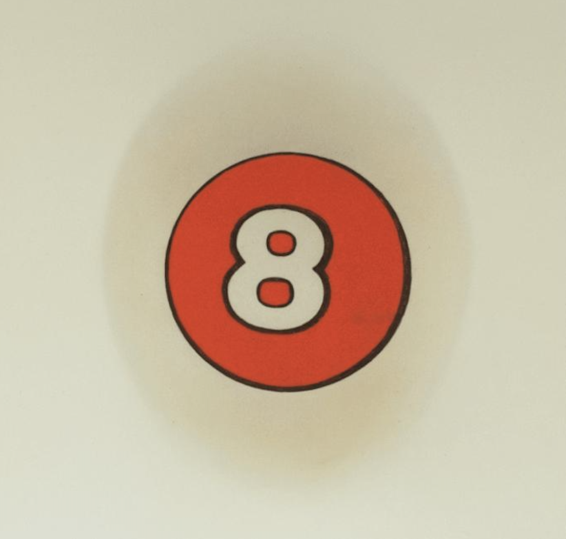
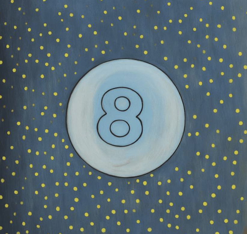
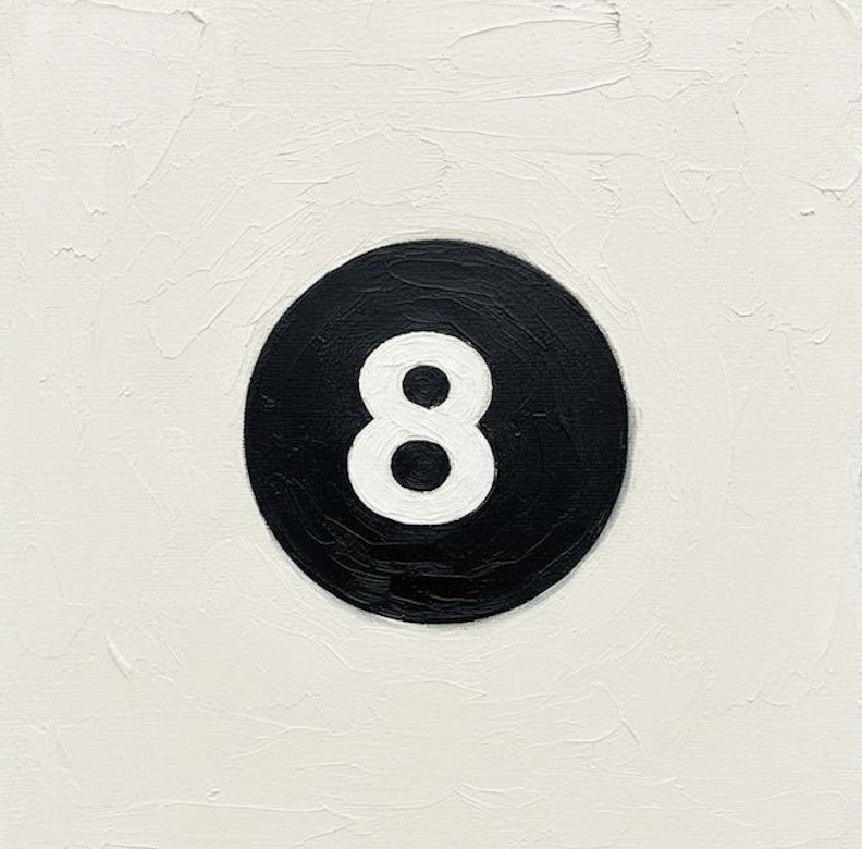
The 8 ball can take on different personalities while maintaining its geometry, serving as a brand motif for Overnight. Our initial identity proposals use 8 ball and repeating circular elements to define the visual language.
Process: logo paired with visual research
.png)



.jpg)
.jpg)
.jpg)













.gif)

.png)



.png)
.png)


.png)

